CoWave
| Role
UX/UI Designer
| Skills
Research
Usability Testing
Prototyping
| Timeline
April - August 2024
| Tools
Figma
Whimsical
Optimal Sorts
Flowmapp
Overview
CoWave is a social platform for collecting and sharing your favorite movies within your social circle. The app allows users to collaborate with others on movie lists and offers recommendations, not just based on watch history, but also on what your friends are currently watching. I developed this responsive app as a solo UX Designer to bring this project to life.

Problem
As streaming sites grow in popularity, it becomes increasingly difficult to choose what movie to watch, keep up with trends, and receive tailored recommendations that truly reflect individual tastes.

Solution
-
Develop a social platform that allows users to track their watched movies through list curation.
-
Provide personalized recommendations and suggestions based on watched movies and friend following.
-
Allow sharing and collaborating amongst friends.

My Role
-
UI/UX and Visual Designer
-
Created interactive prototypes, components, visuals, and user research
-
Worked closely with my mentor and design cohorts during development and iteration
1. Research
& Analysis
.png)
.png)
.png)
.png)
Understanding users' needs and pain points
1.1 Research Plan
In order to organize the whole scope of the research, I crafted out a Research Plan to narrow down the important aspects of the project. In solidifying the context and challenge, the 'How Might We' statement was crafted to begin creating a more intuitive and centralized platform.
%20(Copy)%20(2).png)
1.2 Competitive Analysis
To better understand the market, it is important to research and analyze the different potential competitors and what they had to offer, as well as their weaknesses that could be improved or avoided when creating the new product.
Market research was conducted on 4 similar platforms that track movies, provides ratings and reviews, and provides recommendations from their library catalogs. Competitors were analyzed in a format that highlight key indicators of success and identify areas of improvement based on user reviews, usage statistic, and feature comparisons.

1.3 User Interviews
Following that, I conducted 1:1 interviews with participants ages 22-24 who consume media regularly and are mobile/web users.
My objective was to identify common pain points, determine the factors that influences a user's decision, gain insights to their movie-watching habits, and find areas for improvement.
.png)
x 4
interviewees

With this information plus data gathered from competitive analysis, I was able to narrow down the 2 major problems:
Insight
.png)
Option overload and choice fatigue is frequent

Dependence on friend’s recommendations
Problem

Navigation and discovery becomes difficult to do

Online recommendations aren’t tailor to reflect individual tastes
-
Navigation Difficulty: There are too many streaming sites used and movies released, leaving people to face difficulty navigating and finding movies to watch.
-
Undefined Recommendations: Although word of mouth is key to movie discovery, current platforms lack a social element for gathering recommendations from trusted sources.
.png)
2. Information Architecture
It was essential to establish the site's structure and determine how users would navigate through it.
2.1 Hybrid Card Sorting
To better understand their mental models and meet user needs, I conducted an unmoderated card sorting exercise with participants who were familiar with social media and movies.
x 14
participants

Card sorting made me realize I should focus on narrowing down key features of the app. In minimizing the amount of content, I was able to streamline the layout and enhance accessibility.
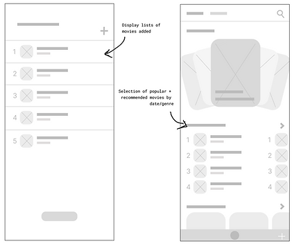
2.2 Site Map
Based on my results, I created the site map to define the navigation hierarchy and guide users through the pages. I took a linear approach in building the initial wireframes by establishing the task/user flow from start to finish.
.png)
2.3 Task Flow
The task flows detail the precise steps a user takes in order sign up, add to their collection, and write a review. These features were chosen because they represent critical touch points that users interact with frequently.

2.4 User Flow
The user flow displays the user experience from when the register an account to creating a collection for their profile.
.png)
3. Ideation & Design
The wireframing process for multiple design variations after establishing the core components of my design.

3.1 Wireframing
%20(Copy)%20(Copy)%20(2).png)
%20(Copy)%20(Copy).png)
I created the layout of the 'User Profile', 'Add a Collection', and 'Discover' page on Figma. I wanted to be simple and intuitive, while also ensuring the interface felt engaging and visually appealing.
User Profile
Add a Collection
Add Movies
Discovery Screen
User Profile
Add to Collection
Add Movies
%20(Copy)%20(Copy)%20(3).png)
Discovery Screen
%20(Copy)%20(Copy)%20(3).png)
Write a Review
Friends' Activity
Mid-Fi Wireframe (click to view)
3.2 Brand Style Guide
The branding process started with establishing the values of the brand. I wanted to emphasize the playful and social nature of CoWave, fostering community, shared experiences, and a sense of adventure.
The pixel-inspired designs and retro colors combine the charm of old-school aesthetics with the convenience of modern technology, making it visually engaging and distinctive from conventional interfaces.


.png)

4. Synthesis & Implementation
With that, the prototype was finalized through user testing and iteration.
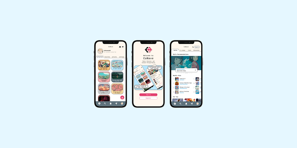
4.1 Hi-Fidelity Prototype
Hi-Fi Wireframe (click to view)
I singled out some improvements to be made for the application based on our user insights and their recommendations for improvement. These have been implemented for the first version of the application.


User Profile
Welcome Screen
Add to Collection
Write a Review
Add Movies
Search Screen
Discovery
Friends' Activity
Building the prototype was the most satisfying part as I got to witness my design turn into something tangible.
This phase allowed me to refine user interactions and ensure that the functionality met the needs for my users.

4.2 Usability Testing
With the high fidelity prototype created, it was important for me to carry on with user testing. This was to make sure that each one of the screens provides purpose and efficiency to the users.
Goal :
To ensure a seamless navigation process, intuitive features, and a visually appealing interface for CoWave.
To determine if participants can successfully navigate through:
-
Onboarding Process
-
Adding to Collection
-
Writing a Review
Objective :


I was pleased with the results, seeing as everyone had 100% completion rate and relatively high satisfaction rate. User feedback has allowed me to further improve on my designs, specifically placement issues and customization potentials.
I created an affinity map and the final deliverables incorporated these updates:

4.3 Improvements Made
Adam Caar
Developer

Before


After
Adam Caar
Developer
Use this space to introduce yourself and share your professional history.


5. Final Design


6. Key Project Takeaways
Here are some things that I have achieved and learned from this project:
.png)
-
Research was hands down the most important process during this project. I always thought research was only done at the beginning, but I’ve learned that it’s an ongoing process. Continuous research helps us understand evolving user needs, and iterative testing ensures that we’re refining and improving the product throughout its development.

-
Constant feedback and iteration is essential throughout the design process. At the beginning, I always wanted my deliverables to be perfect but struggled to make decisions for myself. Luckily, I had the help of amazing designers to give me constructive feedback. I learned that not everything has to be perfect and it's better to present and iterate on designs early on in the process rather than later.
.png)
-
Prioritize the target audience. Initially, I tried to find solutions to satisfy all user problems but that's not a realistic approach. I learned that by understanding the needs of a core group, I could better address their unique challenges and create features that truly resonate with them. This shift in focus allowed me to design with clarity, making the product more impactful rather than trying to be a one-size-fits-all solution.